
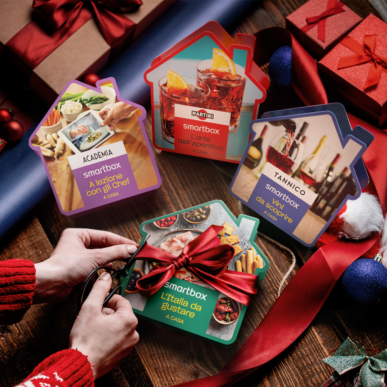
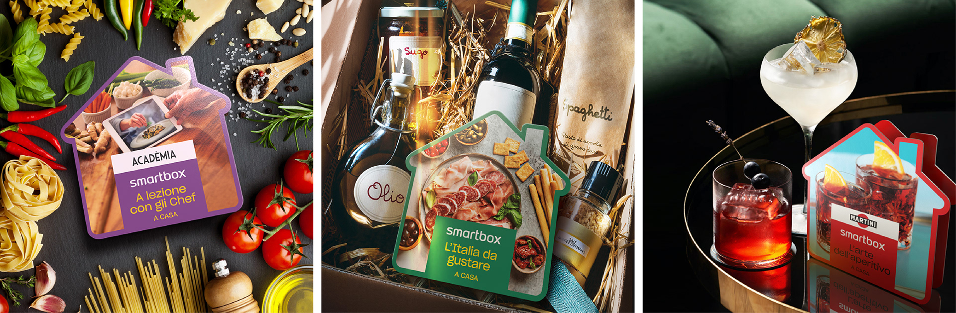
Smartbox — At Home
In response to the COVID-19 pandemic, we designed a disruptive, house-shaped packaging template that redefined the Smartbox experience for life under lockdown.
Moving away from standard rectangular forms, this unique die-cut served as a visual metaphor for bringing premium experiences—like gourmet cooking and mixology, directly into the home.
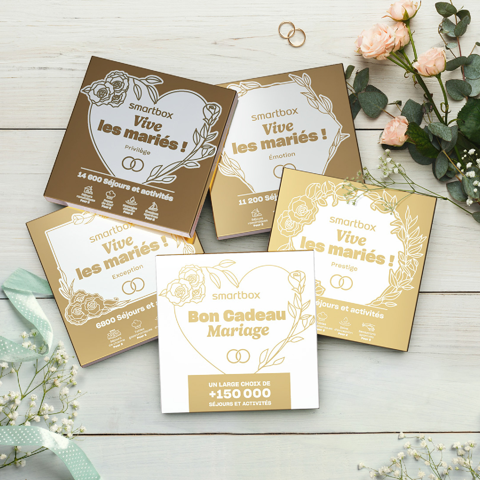
Wedding range
We designed a packaging template for the Wedding range where gold-foil density serves as a silent indicator of value. By increasing the metallic coverage as the price point rises—from delicate accents to full-bleed gold—the design creates an intuitive premium hierarchy on the shelf.
Our role involved creating the structural template and illustrative system, ensuring that each box offered a tactile, high-end unboxing experience that reflected the exclusivity of the gift inside.
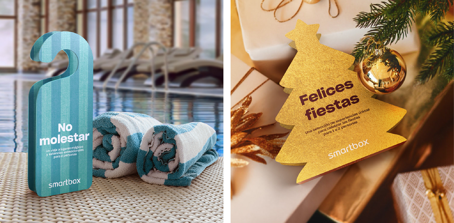
Disruptive packaging
We created these disruptive, theme-driven silhouettes to transform standard gift packaging into a tactile, storytelling object. From "Do Not Disturb" door hangers for wellness retreats to festive Christmas tree die-cuts, these non-traditional forms bypass the standard square box to create an immediate emotional connection and a standout presence in retail.
Key Innovation: Replacing generic geometry with symbolic shapes that serve as a visual "teaser" for the experience inside.
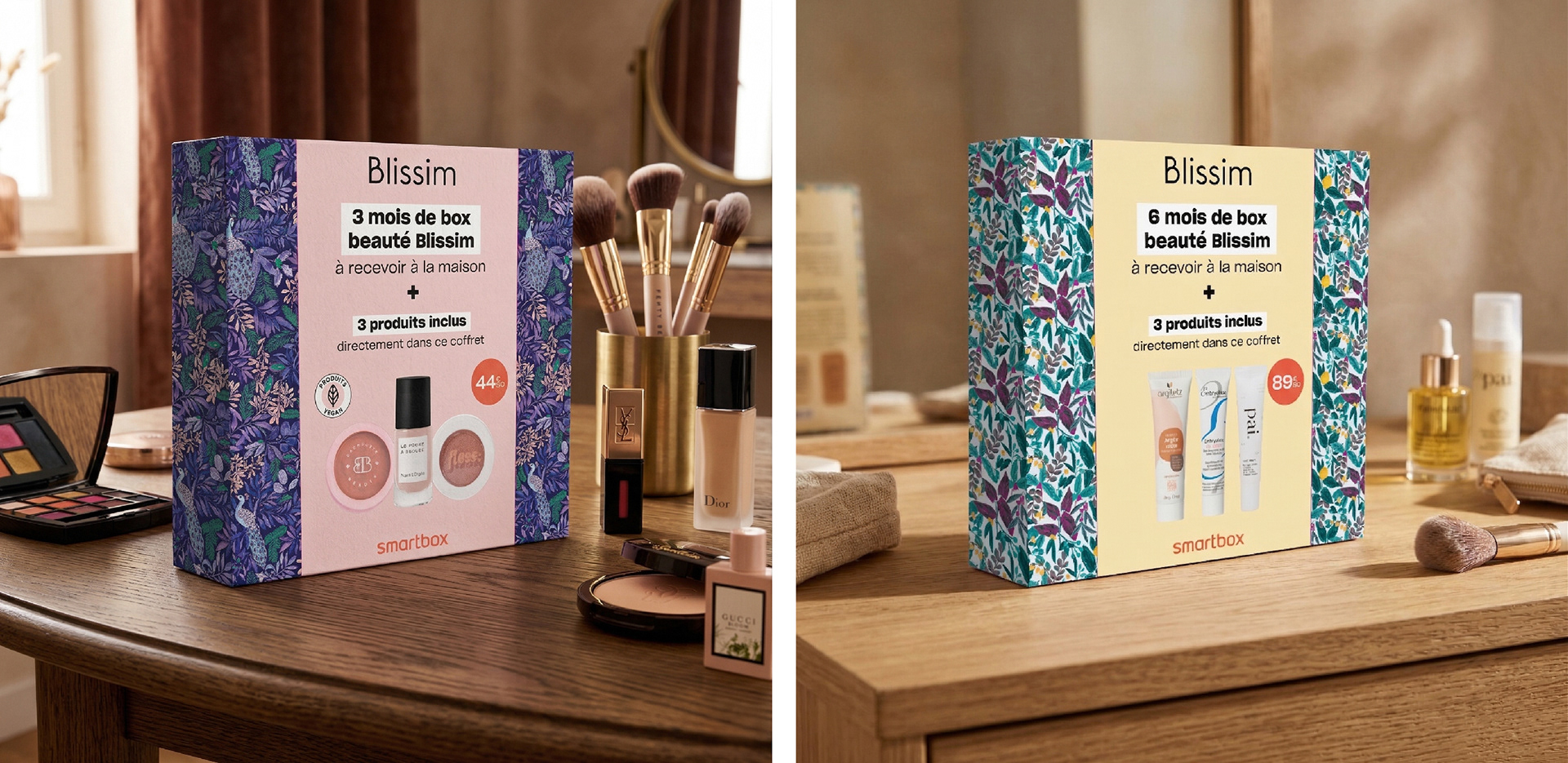
Blissim x Smartbox
Smartbox x Blissim: A Seamless Brand Fusion
Smartbox x Blissim: A Seamless Brand Fusion
I designed these templates by strategically blending Blissim’s signature editorial aesthetic with Smartbox’s core gift identity. The packaging creates an immediate impact, showcasing the physical beauty products inside while clearly communicating the added value of a multi-month home delivery subscription.
The result is a premium, gift-ready box that balances high-impact floral patterns with a clean, functional layout—bridging the gap between a retail object and a long-term service experience.
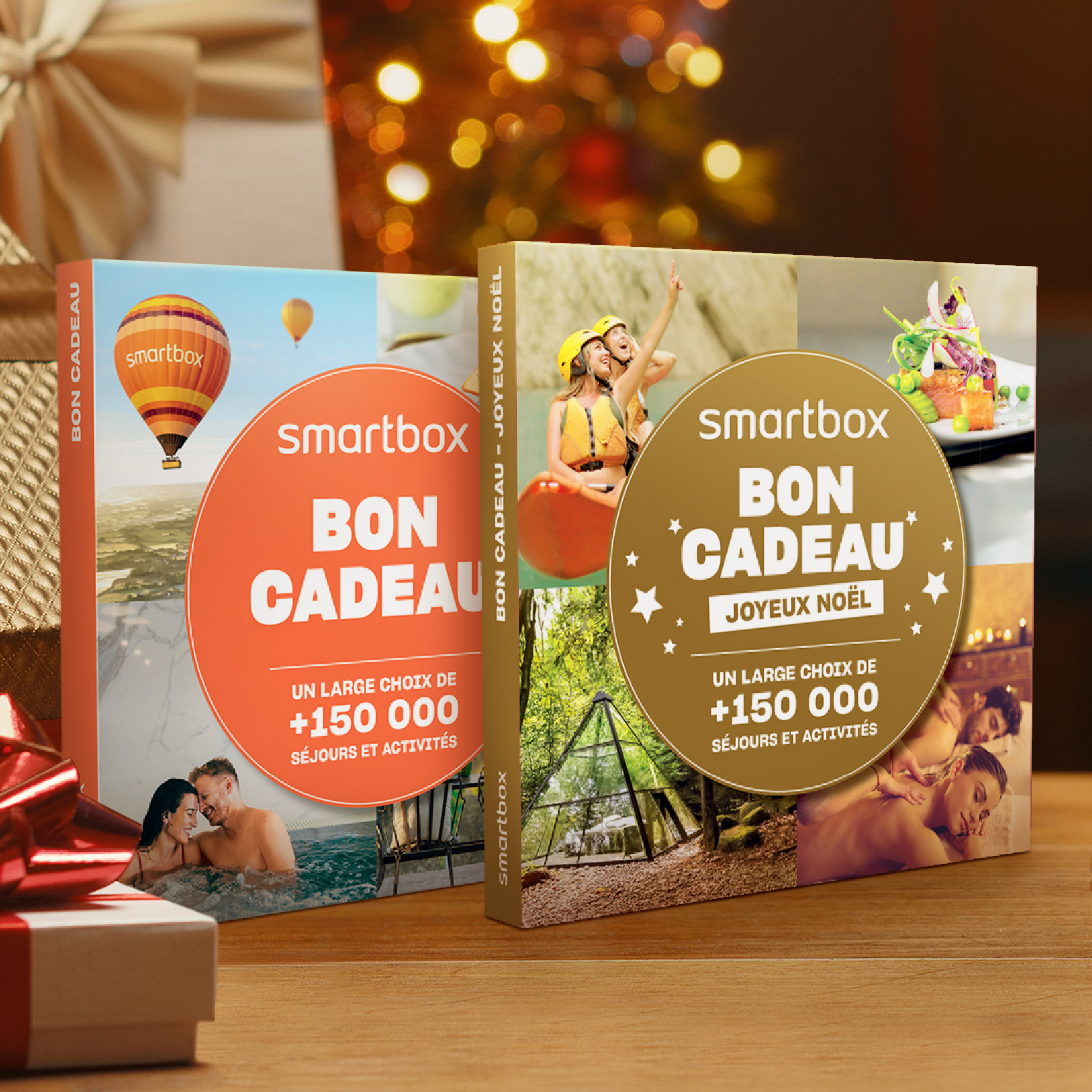
Smartbox — Bon Cadeau
We designed this scalable template to serve as the core of the Smartbox "Bon Cadeau" range. By using a bold, centralized circular motif, the design provides a clear focal point that adapts seamlessly across different seasonal themes and experience categories while maintaining a consistent, high-impact brand identity.
We designed this scalable template to serve as the core of the Smartbox "Bon Cadeau" range. By using a bold, centralized circular motif, the design provides a clear focal point that adapts seamlessly across different seasonal themes and experience categories while maintaining a consistent, high-impact brand identity.
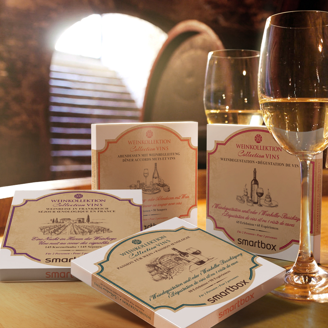
Smartbox — Wine Range
For this premium wine range, we focused on creating a hand-drawn illustrative style that reflects the artisanal nature of oenology. The vintage-inspired sketches on each box serve as a visual "tasting note," immediately showcasing the specific experience inside—whether it’s a vineyard stay, a cellar tour, or a gourmet wine-pairing dinner.
By blending classical line art with a clean, tiered color system, the design elevates the packaging from a simple gift box to an invitation to a sophisticated sensory journey.
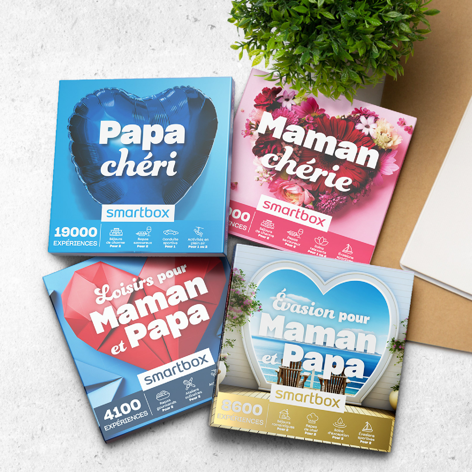
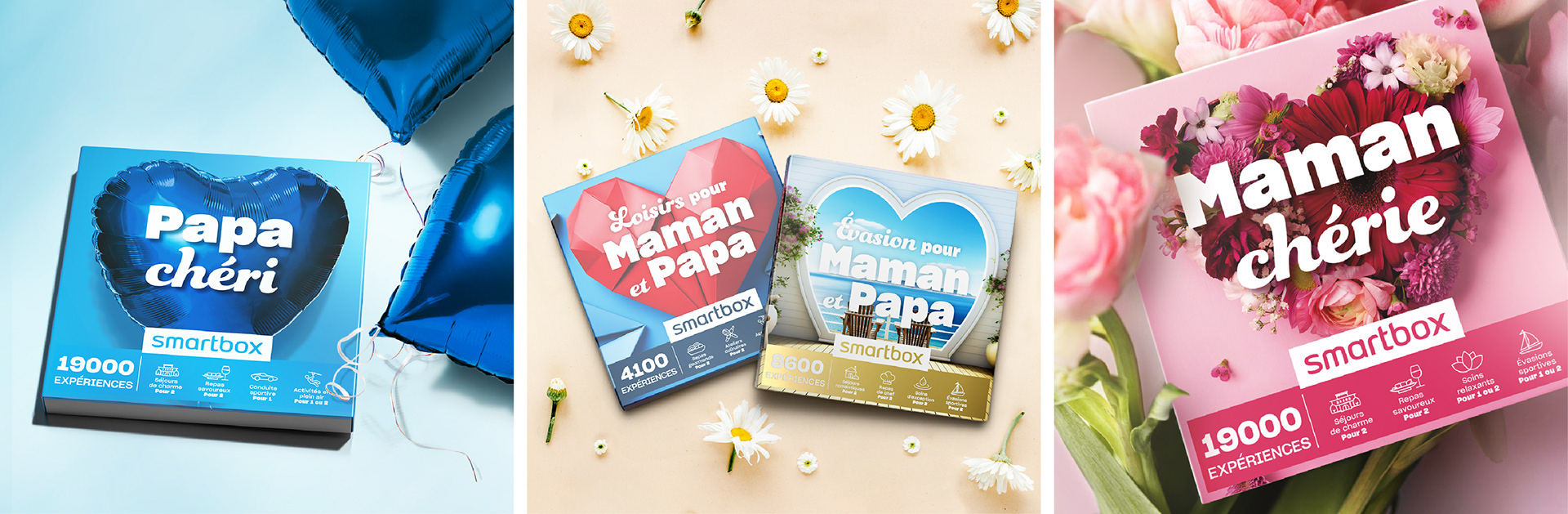
Smartbox — Mother's & Father's Day
For this range, we were in charge of designing the main facings, creating evocative imagery that clearly communicates the "Special Day" offer. By using bold, thematic elements, such as a metallic blue balloon for Father’s Day and vibrant floral arrangements for Mother’s Day. We transformed the box into a high-impact visual message that resonates emotionally on the retail shelf.
Our role focused on combining strong typography with symbolic textures, ensuring that the face of each box acts as an immediate invitation to celebrate a parent with a premium experience.
Mockups created by Diego Bertolo and Chester Santos